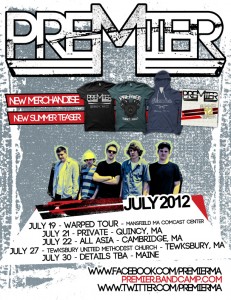
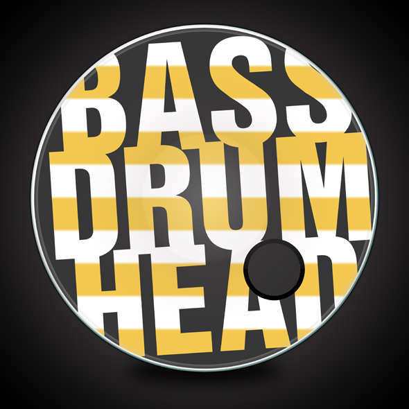
I just finished a new flyer for the band Premier! I have been working with them on several projects such as: T-Shirts, Logo, Drum Head, Business Cards, Sweatshirts and a few other things. Last week they managed to get on to Warped Tour and they wanted a flyer that could show off the new merch, promote the new teaser (CD) that I designed and promote the full schedule these guys had in July.
I wanted to give them something that would stick out yet somewhat match their current theme of designs. I used simple shapes and created boxes for the text. After that I created the background using texture’s that I’ve been using on their design. I decided to use the picture of them and incorporate that into the design itself. I also decided that since they are more of a punk style band that it would be appropriate to make the picture of them cut out choppy, instead of cropping out the entire background for a more professional look.
Once I finished up adding in the picture all chopped up I used a bit of yellow in the whites to give it an even better flare into the punk look. I added the merchandise in order so that it could present itself but not distract to much from the show section showing off the Warped Tour date. I added the background in last as a texture I found in Photoshop and changed the color of it so that it matched with what I was going for. After that it was pretty much completed except for adding the links in the bottom of course. I think it looks really cool and matches exactly what I was trying to achieve overall. They liked it as well 🙂


